CSS Radial Gradients
CSS gradients let you display smooth transitions between two or more specified colors.
CSS defines three types of gradients:
- Linear Gradients (goes down/up/left/right/diagonally)
- Radial Gradients (defined by their center)
- Conic Gradients (rotated around a center point)
CSS Radial Gradients
A radial gradient is defined by its center.
To create a radial gradient you must also define at least two color stops.
background-image: radial-gradient(<shape> <size> at <position>, <start-color>, ..., <last-color>);
By default, shape is ellipse, size is farthest-corner, and position is center.
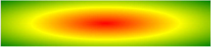
Radial Gradient: Evenly Spaced Color Stops (default)
The following example shows a radial gradient with evenly spaced color stops:
#grad {
	background-image:  radial-gradient(red, yellow, green);
}
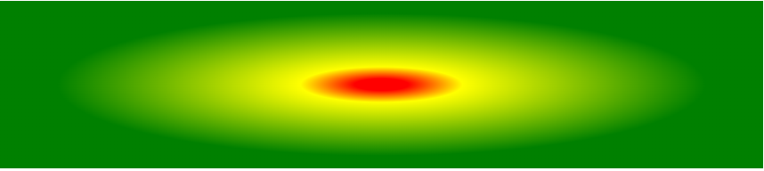
Radial Gradient: Differently Spaced Color Stops
The following example shows a radial gradient with differently spaced color stops:
#grad {
	background-image:  radial-gradient(red 5%, yellow 15%, green 60%);
}
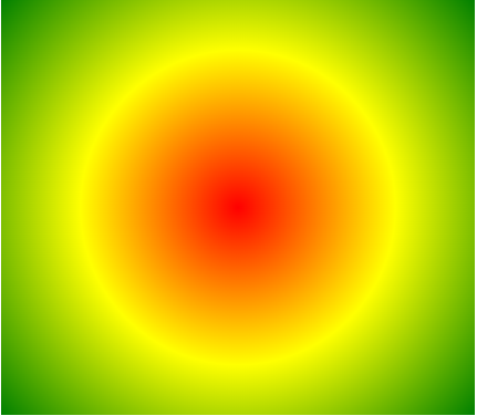
Set Shape
The shape parameter defines the shape. It can take the value circle or ellipse. The default value is ellipse.
The following example shows a radial gradient with the shape of a circle:
#grad {
	background-image:  radial-gradient(circle, red, yellow, green);
}
Use of Different Size Keywords
The size parameter defines the size of the gradient. It can take four values:
- closest-side
- farthest-side
- closest-corner
- farthest-corner
#grad1 {
	background-image:  radial-gradient(closest-side at 60% 55%, red, yellow, black);
}

#grad2 {
	background-image:  radial-gradient(farthest-side at 60% 55%, red, yellow, black);
}
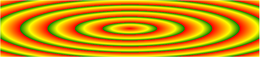
Repeating a radial-gradient
The repeating-radial-gradient() function is used to repeat radial gradients:
#grad {
	background-image:  repeating-radial-gradient(red, yellow 10%, green 15%);
}