CSS Grid Item
Child Elements (Items)
A grid container contains grid items.
By default, a container has one grid item for each column, in each row, but you can style the grid items so that they will span multiple columns and/or rows.
The grid-column Property:
The grid-column property defines on which column(s) to place an item.
You define where the item will start, and where the item will end.
The grid-column property is a shorthand property for the grid-column-start and the grid-column-end properties.
To place an item, you can refer to line numbers, or use the keyword span to define how many columns the item will span.
Examples
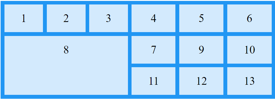
Some examples referred to grid showed in previous example.
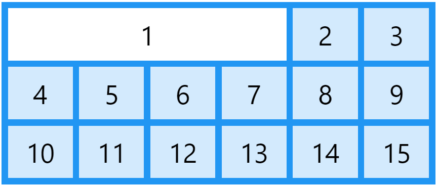
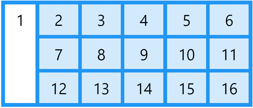
Make "item1" start on column 1 and end before column 5:
.item1 {
	grid-column:  1 / 5;
}
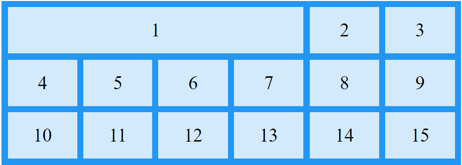
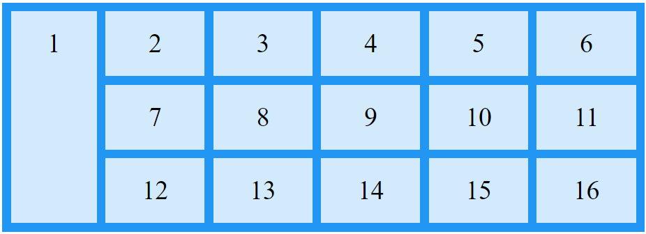
Make "item1" start on column 1 and span 3 columns:
.item1 {
	grid-column:  1 / span 3;
}
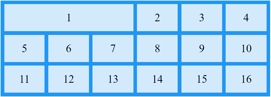
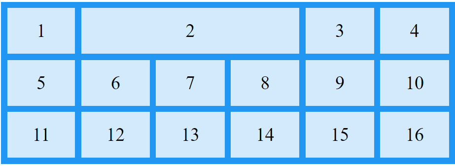
Make "item2" start on column 2 and span 3 columns:
.item2 {
	grid-column:  2 / span 3;
}
The grid-row Property
The grid-row property defines on which row to place an item.
You define where the item will start, and where the item will end.
The grid-row property is a shorthand property for the grid-row-start and the grid-row-end properties.
To place an item, you can refer to line numbers, or use the keyword span to define how many rows the item will span.
Examples
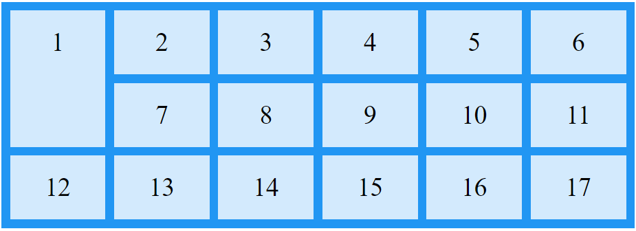
Make "item1" start on row-line 1 and end on row-line 4:
.item1 {
	grid-row:  1 / 4;
}
Make "item1" start on row 1 and span 2 rows:
.item1 {
	grid-row:  1 / span 2;
}
The grid-area Property
The grid-area property can be used as a shorthand property for the grid-row-start, grid-column-start, grid-row-end and the grid-column-end properties.
Examples
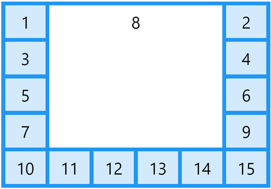
Make "item8" start on row-line 1 and column-line 2, and end on row-line 5 and column line 6:
.item8 {
	grid-area:  1 / 2 / 5 / 6;
}
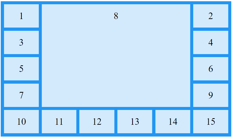
Make "item8" start on row-line 2 and column-line 1, and span 2 rows and 3 columns:
.item8 {
	grid-area:  2 / 1 / span 2 / span 3;
}
Naming Grid Items
The grid-area property can also be used to assign names to grid items.

Named grid items can be referred to by the grid-template-areas property of the grid container.
Example: Item1 gets the name "myArea" and spans all five columns in a five columns grid layout:
.item1 {
	grid-area:  myArea;
}
.grid-container {
	grid-template-areas:  'myArea myArea myArea myArea myArea';
}
- Ech row is defined by apostrophes
' ' - The columns in each row is defined inside the apostrophes, separated by a space.
- A period sign represents a grid item with no name.
Example: "myArea" span two columns in a five columns grid layout (period signs represent items with no name):
.item1 {
	grid-area:  myArea;
}
.grid-container {
	grid-template-areas:  'myArea myArea . . .';
}
To define two rows, define the column of the second row inside another set of apostrophes.
Example: make "item1" span two columns and two rows:
.grid-container {
	grid-template-areas:  'myArea myArea . . .' 'myArea myArea . . .';
}
The Order of the Items
The Grid Layout allows us to position the items anywhere we like.
Example: The first item in the HTML code does not have to appear as the first item in the grid.
.item1 { grid-area:  1 / 3 / 2 / 4; }
.item2 { grid-area:  2 / 3 / 3 / 4; }
.item3 { grid-area:  1 / 1 / 2 / 2; }
.item4 { grid-area:  1 / 2 / 2 / 3; }
.item5 { grid-area:  2 / 1 / 3 / 2; }
.item6 { grid-area:  2 / 2 / 3 / 3; }

You can re-arrange the order for certain screen sizes, by using media queries:
@media only screen and (max-width: 500px) {
	.item1  { grid-area:  1 / span 3 / 2 / 4; }
	.item2  { grid-area:  3 / 3 / 4 / 4; }
	.item3  { grid-area:  2 / 1 / 3 / 2; }
	.item4  { grid-area:  2 / 2 / span 2 / 3; }
	.item5  { grid-area:  3 / 1 / 4 / 2; }
	.item6  { grid-area:  2 / 3 / 3 / 4; }
}