HTML Responsive Web Design
Responsive web design is about creating web pages that look good on all devices!
A responsive web design will automatically adjust for different screen sizes and viewports.
What is Responsive Web Design?
Responsive Web Design is about using HTML and CSS to automatically resize, hide, shrink, or enlarge, a website, to make it look good on all devices (desktops, tablets, and phones).
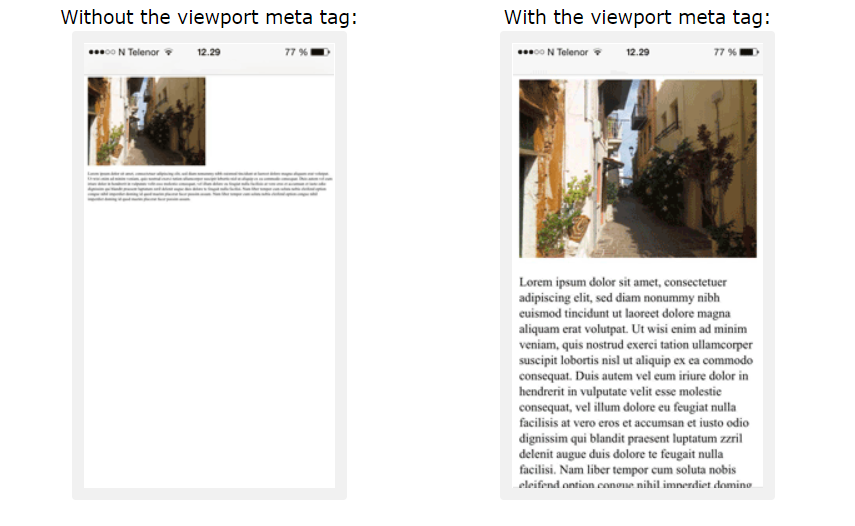
Setting The Viewport
To create a responsive website, add the following <meta> tag to all your web pages:
<meta name="viewport" content="width=device-width, initial-scale=1.0">
This will set the viewport of your page, which will give the browser instructions on how to control the page's dimensions and scaling.
Here is an example of a web page without the viewport meta tag, and the same web page with the viewport meta tag:
Responsive Images
Responsive images are images that scale nicely to fit any browser size.
Using the width Property
If the CSS width property is set to 100%, the image will be responsive and scale up and down.
Example:
<!DOCTYPE html>
<html>
	<meta name="viewport" content="width=device-width, initial-scale=1.0">
	<body>
		<h2>Responsive Image</h2>
		<p>When we set the CSS width property to 100%, it makes the image responsive.
		Resize the browser window to see the effect.</p>
		<img src="my-image.jpg" style="width:100%;">
	</body>
</html>
A problem with the above method (width: 100%) is that the image can be scaled up to be larger than its original size. So, it is better to use the max-width property instead.
Using the max-width Property
If the max-width property is set to 100%, the image will scale down if it has to, but never scale up to be larger than its original size.
<!DOCTYPE html>
<html>
	<meta name="viewport" content="width=device-width, initial-scale=1.0">
	<body>
		<h2>Responsive Image</h2>
		<p>When we set the CSS width property to 100%, it makes the image responsive.
		Resize the browser window to see the effect.</p>
		<img src="my-image.jpg" style="max-width:100%;height:auto;">
	</body>
</html>
Show Different Images Depending on Browser Width
The HTML <picture> element allows you to define different images for different browser window sizes.
<!DOCTYPE html>
<html>
	<meta name="viewport" content="width=device-width, initial-scale=1.0">
	<body>
		<h2>Change Images Depending on Browser Width</h2>
		<picture>
		<source srcset="img_smallflowers.jpg" media="(max-width: 600px)">
		<source srcset="img_flowers.jpg" media="(max-width: 1500px)">
		<source srcset="flowers.jpg">
		<img src="img_flowers.jpg" alt="Flowers" style="width:auto;">
		</picture>
	</body>
</html>
Responsive Text Size
The text size can be set with a "vw" unit, which means the "viewport width".
<!DOCTYPE html>
<html>
	<meta name="viewport" content="width=device-width, initial-scale=1.0">
	<body>
		<h1 style="font-size:10vw;">Here size is 10vw.</h1>
		<p style="font-size:6vw;">Here size is 6vw.</p>
		<p style="font-size:4vw;">Here size is 4vw.</p>
		<p>Resize the browser window to see how the text size changes.</p>
	</body>
</html>
Viewport is the browser window size. 1vw = 1% of viewport width. If the viewport is 50cm wide, 1vw is 0.5cm.
Media Queries
In addition to resize text and images, it is also common to use media queries in responsive web pages.
With media queries you can define completely different styles for different browser sizes.
To learn more about Media Queries and Responsive Web Design, read our Responsive Web Design Tutorial and our CSS Tutorial .